How to design a shop
So you’re ready to launch your first shop. The paperwork is signed, location secured, but now you need to know how to design a shop for the first time.
Before you open though, its important that you get your store design right. The visuals of a shop are the first thing potential customers see and can shape a customers opinion of your business straight away.
People love to judge a book by its cover, so here’s our guide on how to design a shop.
Grab people’s attention
Let’s approach the design of your shop from a customer’s perspective, which begins at street level. You want to grab the attention of any passers-by the best you can.
Shops with clear signage have a good advantage when it comes to drawing customers in. Major, iconic brands have the benefit of being easily recognised by people walking by. Opening a new business means you’ll have a lot more work to do to tell your potential customers about what your shop can offer.
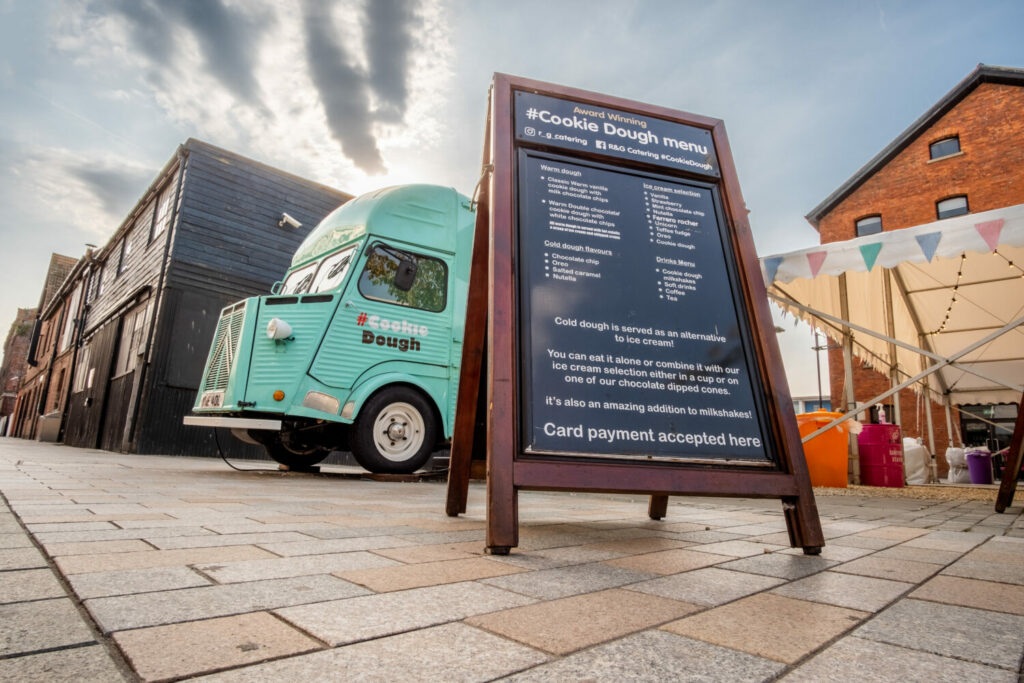
So tell your customers as much as you can about your business on street level! Signage such as A-boards are a great way to provide some extra information on what you can offer. They can also be placed away from your shop if it’s in a place that’s slightly out the way. Be sure to check with local your local authority on rules surrounding what you can place at street level.

Design an attractive storefront
Once you’ve piqued the interest of any potential customers, they’re going to want to find out some more information about your shop.
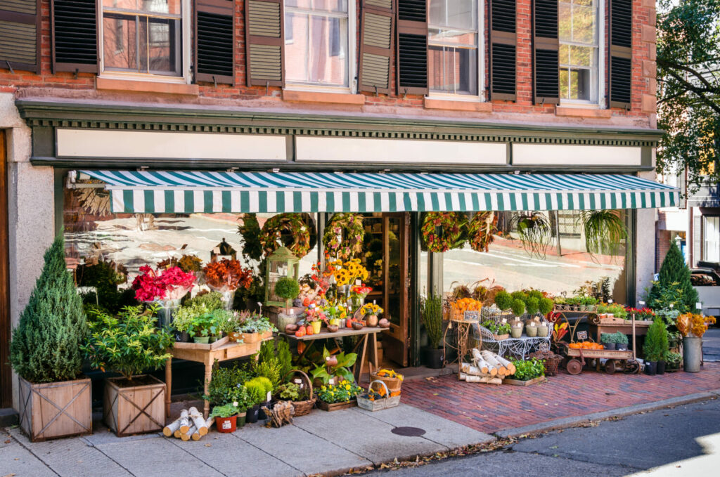
This is where storefront design and ‘window-shopping’ come in. People shop with their eyes before their wallets, so give them something great to look at!
The window is a great place to show off any flagship products or can tell customers about any sales. It’s not just a place for products, though. Making use of stickers, decals, and writing on windows can give information on products not suited for a window display.
You also want to keep the area in front of your shop clear, if you have enough space out front don’t be afraid to utilise it for displays. Big stores at retail parks do this all the time, as the front of your shop is a great place to promote seasonal or outdoor products.

Design a shop interior
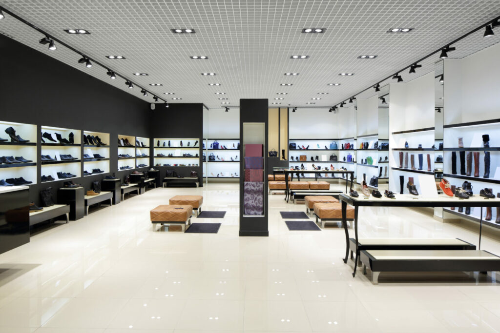
Once your customer is in the store you need to ensure the internal design and layout both reflects your brand, and is easy to navigate.
A technique used to help store navigation is the use of decompression zones.
These are open zones at the entrance of the store. They give customers the chance to survey what’s in front of them and pick out what they might need. Avoid putting key merchandise in compression zones, as customers are more likely to take a broad look around the entire shop before they start to browse.

Then think about how your customers will navigate around the store and how to facilitate this.
For example, if you choose to organise your shop in a clockwise manner, placing the counter by the right-hand side of the entrance provides a nice flow for customers, giving them a chance to explore the entire store.
Conversely, some stores where customers come for specific products such as supermarkets or convenience stores may benefit from a classic, grid style layout, allowing you to store more products in a smaller amount of space. This doesn’t mean you can’t upsell, though. Make use of the ends of aisles to show products on sale or those that might be purchased out of impulse.
This ties in with the philosophy behind the decompression zones. You want to give customers a break when browsing, sometimes called ‘speed bumps’. These are zones in between the main shelves where you can show off smaller displays or key products. Put something interesting here and give shoppers a chance to take a break. Even if they don’t pick anything up here, they won’t leave your shop feeling overwhelmed.
Once you’ve settled on a layout, don’t be afraid to switch it up every now and then! As you learn more about your new customers you may find a design which suits their buying habits better.
What your customers see during their time at your shop can make a major influence on their purchasing decisions, which is why design is so important.
So while these tips can provide some valuable insight to new retailers, nothing compares to an original design. Ultimately, the design of your shop should reflect what your brand is all about. So make it your own!
Looking for the ideal retail property? Check out shops to rent on Completely Retail.